Aboard
2024
/
B2B
/
AI

+ $40k
annual revenue
- 15%
support tickets
- 36%
time on task
Team
Design Manager,
Product Designer (Me),
PM
Engineering Squad
Timeline
Jul - Aug 2024
Role
Research, Product Design, Testing
Deliverables
High-fidelity mockups
Component Specs
Interaction Notes & Prototypes
Handoff summary/ walkthrough
Aboard's rigid data-record card structure frustrated users and limited market expansion, highlighting the need for improved data management workflows.

no flexibility in organizing data
waste of screen space
too much scrolling
lack of hierarchy between sections
Why does this matter?
Aboard wanted to scale...the challenge wasn’t just about displaying data—it was building a layout that could flex for any team, any workflow.
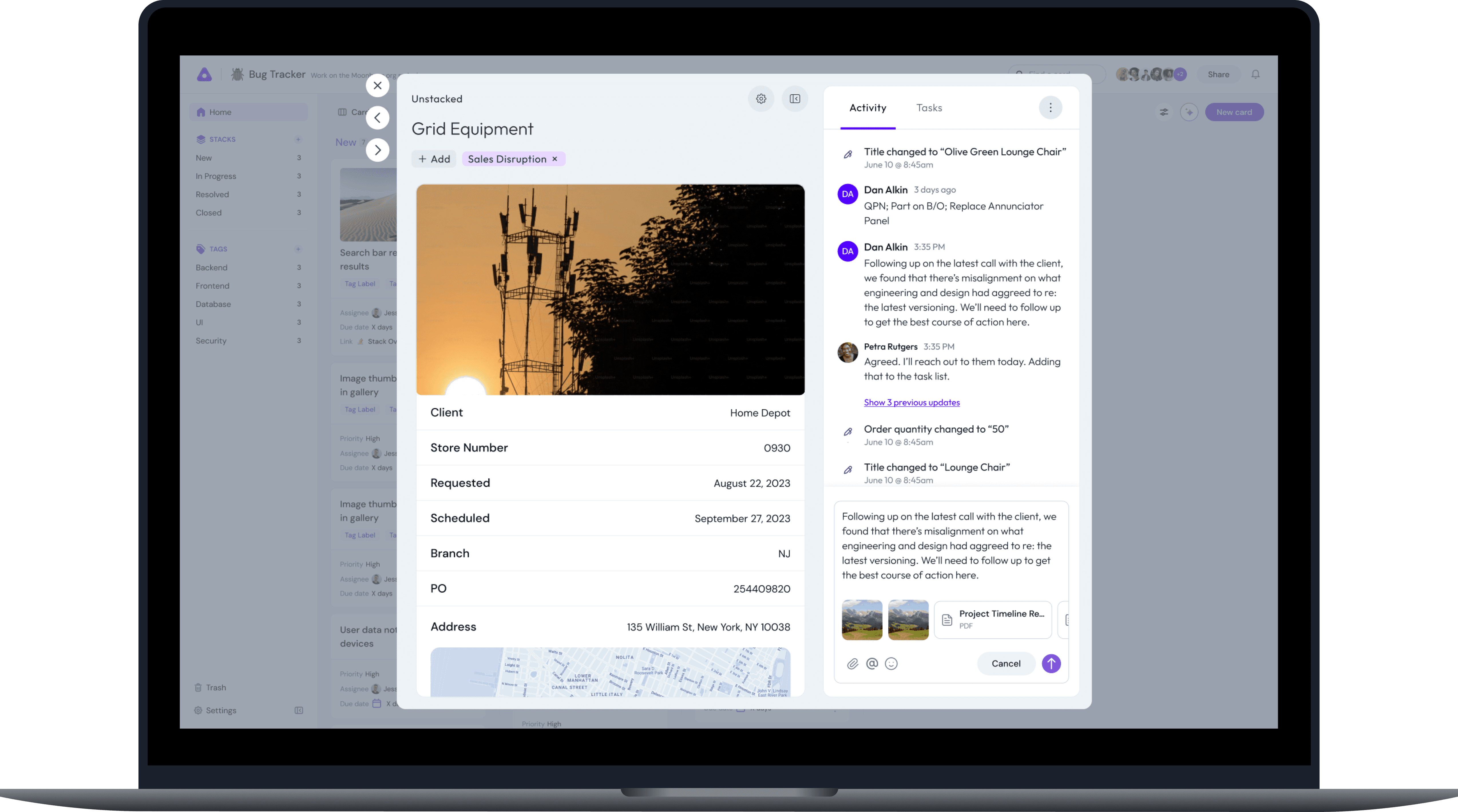
Reconfiguring card structure through 5+ iterations
I explored different design directions. Some explored drag and drop of modules, others explored drawer-based organization, and some even emphasized high data density using multiple columns for data fields. I discussed trade-offs with leadership to figure out what we want to prioritize and compromise on.

Solution
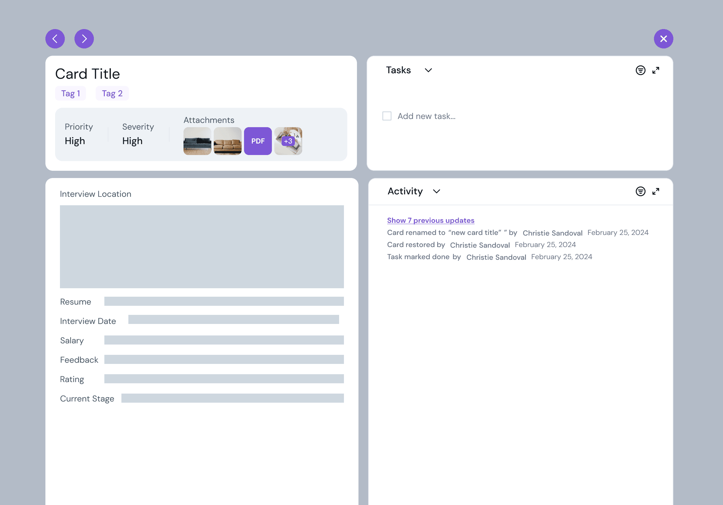
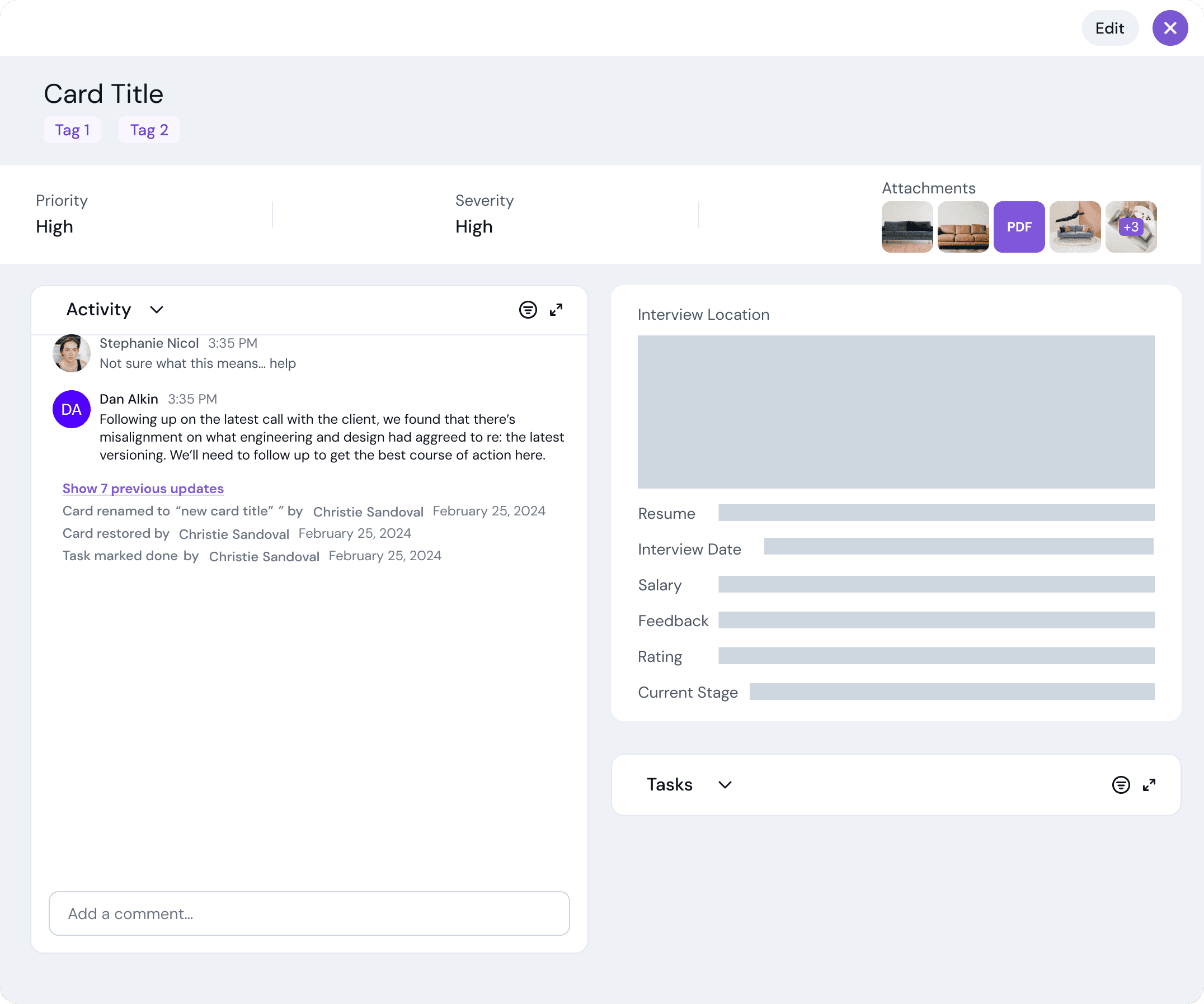
A customizable, scannable, and modular layout.
Feature 1: Progressive Disclosure using drawer menus
We did not want to put everything into tabs, but we decided that data fields are the most important. So allowing users to toggle between comments and tasks was a good balance between not displaying unnecessary information and hiding information too deep.


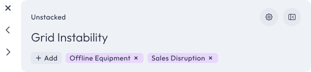
Feature 2: Clear, Flexible, Contextual Hierarchy

During our conversations, it became clear that data fields are the most important, they're the meatiest part of any database, making it the primary module. So the left pane displays the most critical information front and center and helps users focus on what's important.
On the other hand, secondary data like comments, activity and tasks, will live inside a drawer that opens up, on the right side.
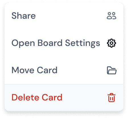
Feature 3: Making tertiary <> less important actions (like adding or deleting fields) less discoverable

We moved the "add fields" button to the bottom. Once users have created data fields (like in a database), this is usually a low-usage action.
Also, moving card controls into a settings menu to use up most of the real data to show information.
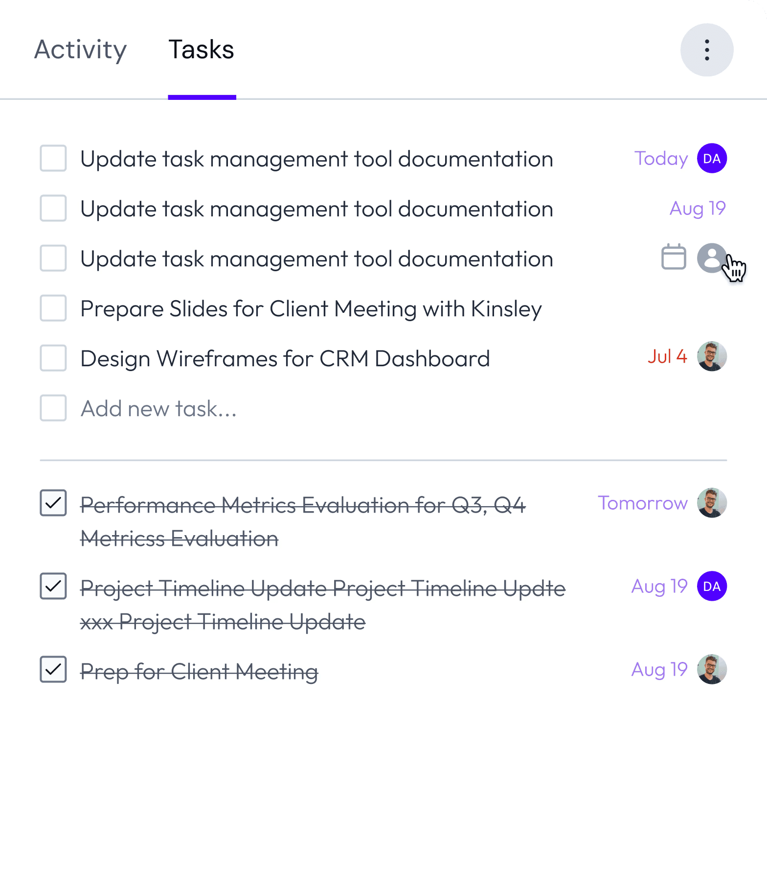
Feature 4: Low Drag, Stress Free Task Management
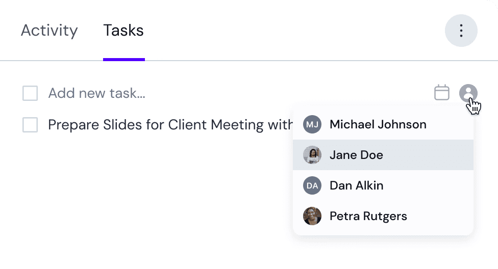
I made key actions faster with inline editing and made it easier to focus by visually deprioritizing completed work
Also, creating more visual contrast for urgent tasks to draw attention helped users focus on what needs their immediate attention.
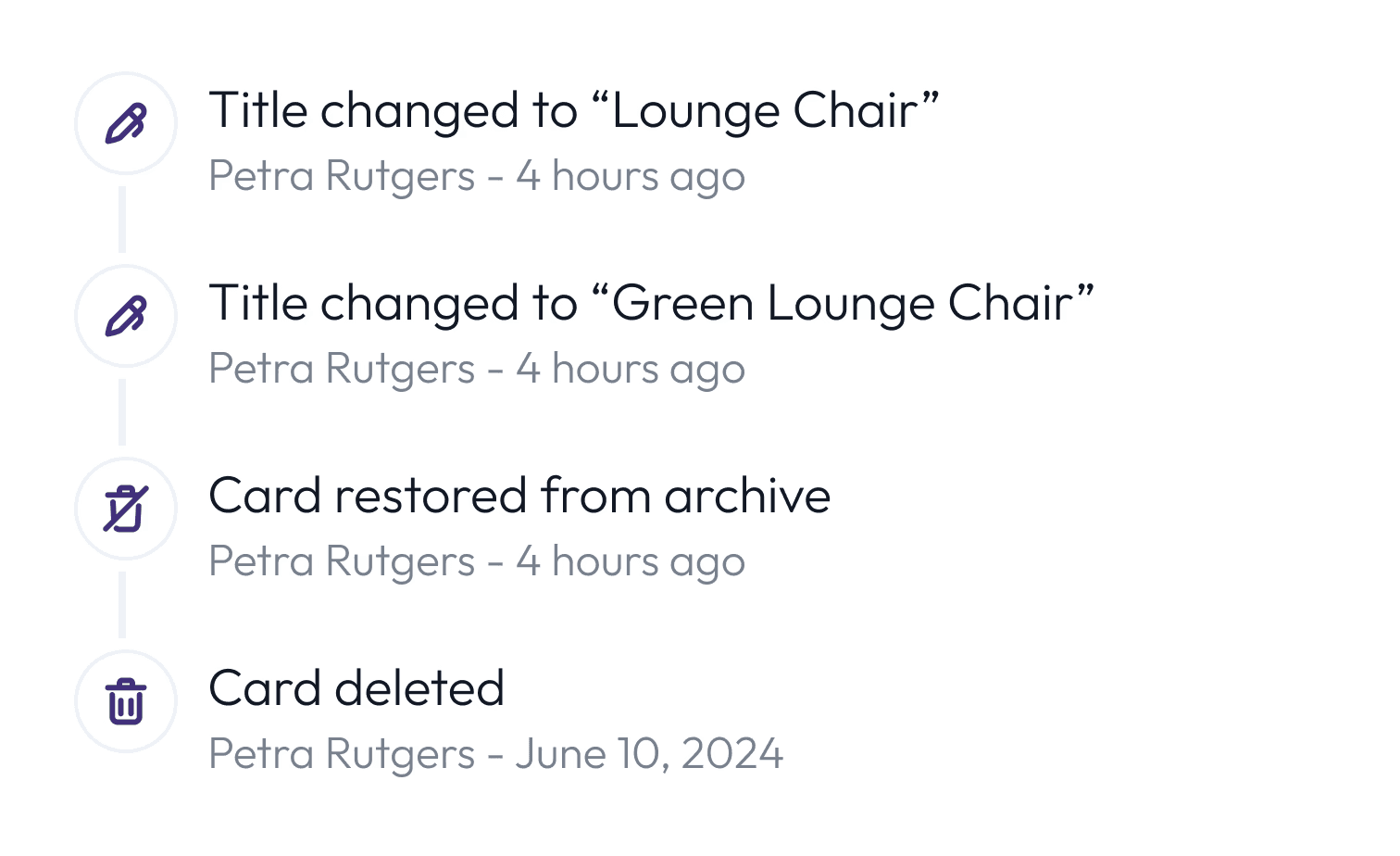
Feature 5: Readable Comments and Activity Sections
I redesigned the activity and comments panel to enhance information digestibility by organizing multiple updates into a collapsible list, effectively mitigating clutter from older or less relevant entries. Furthermore, I refined the typography and optimized the overall design to highlight critical details, such as the commenter’s identity, the timestamp of each comment, and the timing of updates to the card. These improvements ensure that the most important information stands out first.

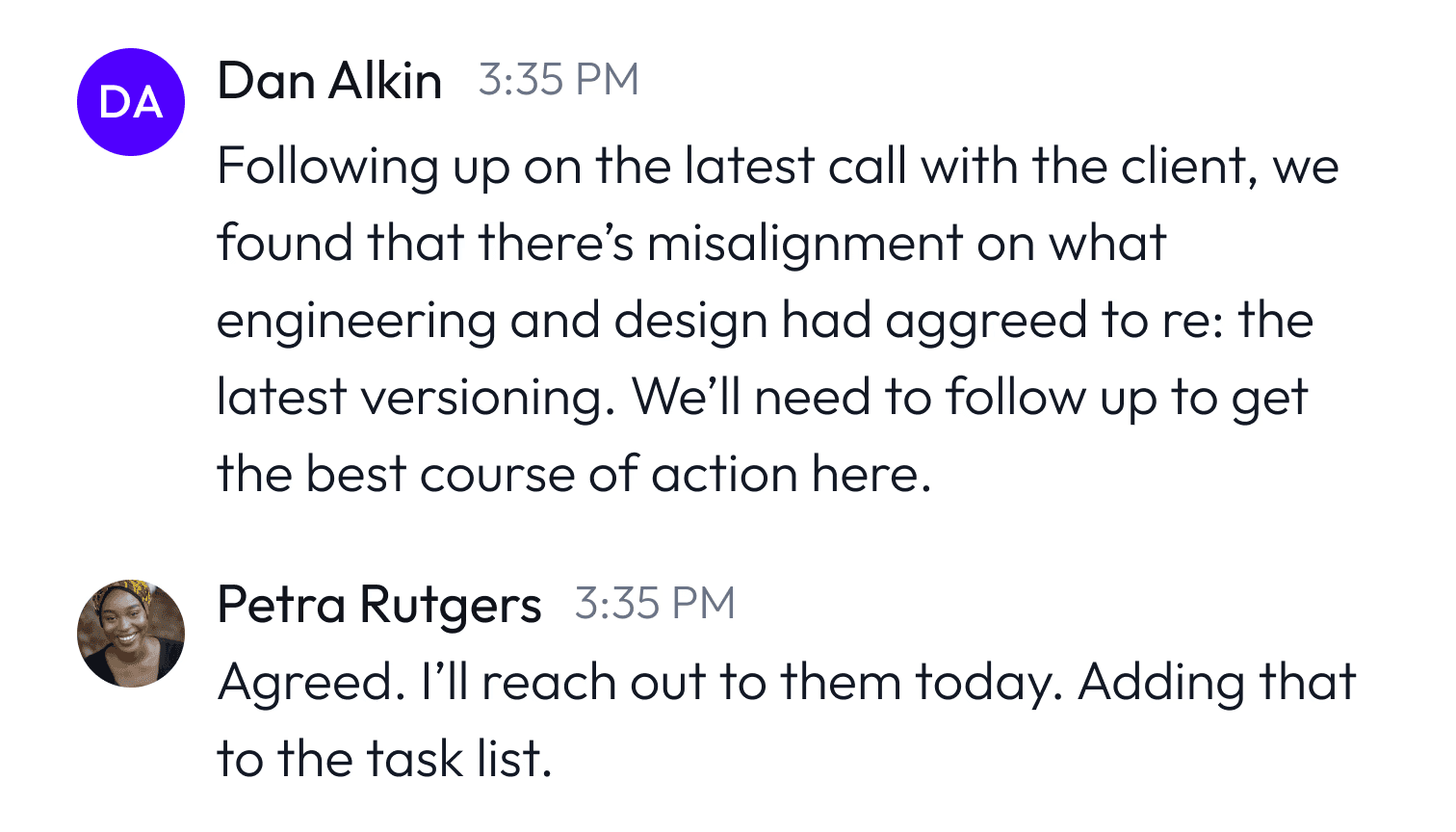
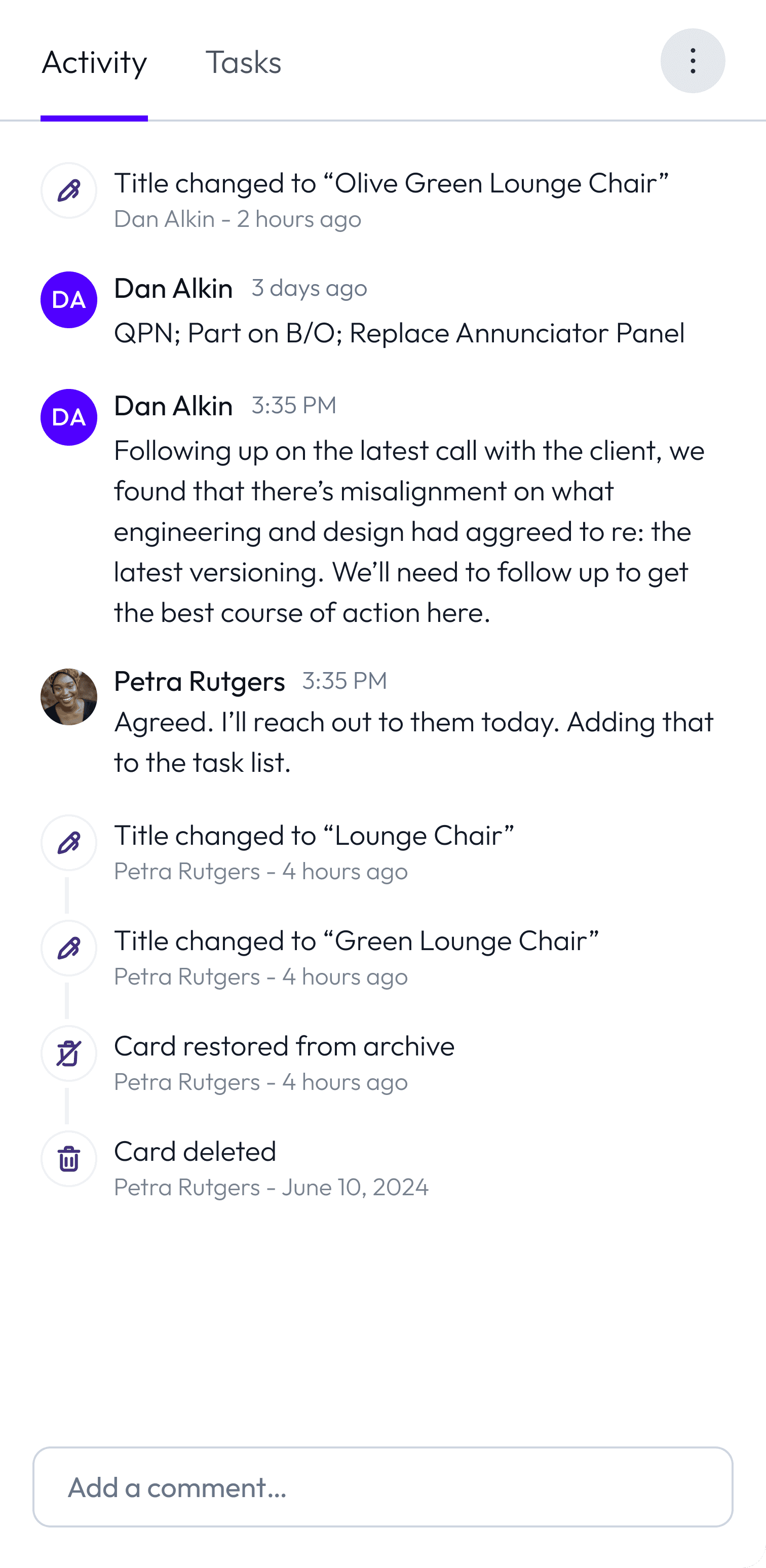
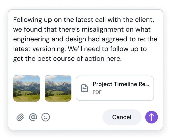
Feature 6: Cleaner, Responsive Commenting UX
In the comment input box, I worked on resizing the layout and adapting to user input, ensuring that attachments are the right size, and having controls stacked away neatly in a corner.

Completed tasks cascade into a separate list, keeping the active task view clean and focused, helping users stay on top of their work without distractions.
Completed tasks cascade into a separate list, keeping the active task view clean and focused, helping users stay on top of their work without distractions.
Impact
"This nails both where we are now and directionally where we want to go. Much more legible and flexible."
+ $40k
annual revenue
we were running up against a tight deadline and managed to bring on a new client with the redesign of core workflows
- 15%
support tickets
The UX was more consistent and not clunky anymore.
- 36%
time on task
"I can finally find the information I need, quickly"